Historical Uptime
Overview
Either if you use it in an internal dashboard, or externally with customers (see Learn about Public or External Sharing), uptime showcase easily communicate when your services experienced an incident.
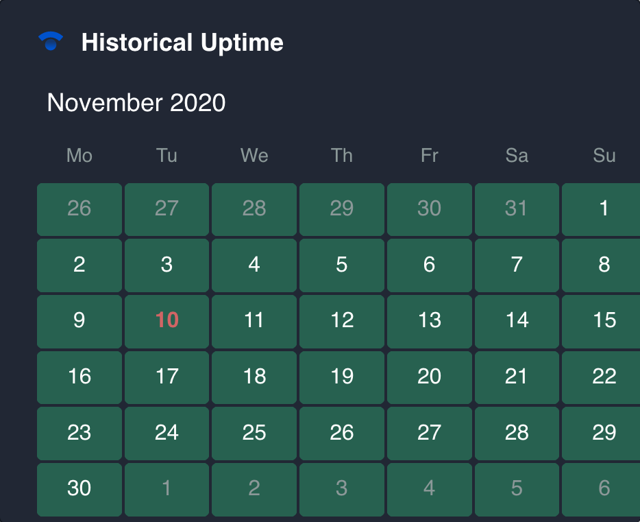
This gadget displays in a calendar view the days your components had no downtimes or incidents. The color code is quite simple, green when there were no incidents at all, and red, when something happened that day. There’s no distinction between a little downtime or a total outage, so focus on having a green field!
Configuration
Name your gadget meaningfully, so everyone knows at a glance what it is about and when to use it. Fill out the rest of the fields as applicable, namely:
The datasource, select a Statuspage datasource (see Add and Manage Datasources).
The Statuspage page where your components are located. A component represents each of the separate infrastructure or functional part of your service.
The period to retrieve the history of incidents. The default view is a month, but you can navigate through the months in case you decide to fetch further data.
Finally, indicate if you want to use the current settings for all the compatible gadgets in the dashboard. This option eases the pain of configuring one by one the rest of the gadgets with the same default configuration.
Integrations
:statuspage:
We are working on our growing catalog of Dashboard Gadgets: KPIs and Metrics and Dashboard Integrations: Supported Products, but contact us you want us to expedite a specific one, visit our Help Center.
Dashboards
This gadget appears in the following dashboard: DevOps Software Team template.