PQL Custom Charts
Overview
Projects in Jira require enough information to properly track their status and control a successful result. For doing so, Projectrak by DEISER provides a unique solution to add custom fields to projects, making data annotation a simple and smooth process. Review all the benefits that this app brings, like predefine fields ready right after installing it; the list view of projects to see your portfolio information at a glance; the release view to keep your version planning visible for all stakeholders, etc.
This gadget displays the result of a PQL query, as a table or a chart. Indicate a custom PQL, then indicate how you want to display the results View Type, the Columns you want to display in your report in case of a table (drag and drop to change the order), and performing grouping and/or aggregations (see next sections for further information).
Projectrak provides the Project Query Language (PQL), which is like the Jira Query Language (JQL), but to query data from your projects.
For example, to list all the projects in the software category where the Country is Germany or the Continent is Europe, then use the following PQL query:
category = development AND ( Country = Germany OR Continent = Europe )
You can select any of the following visual metaphors to represent the resulted data by the JQL in the View Type field: Table, line chart, tile chart, pie chart, bar chart, grouped bar chart, stacked bar chart or multi line chart.
View type: Table
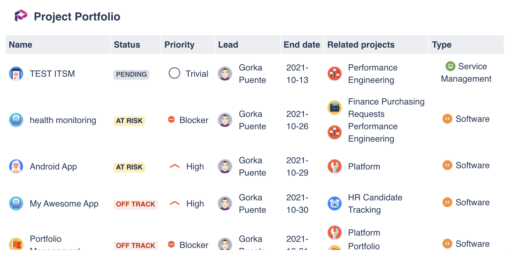
The results of your PQL query as a table, where you can select which columns are displayed.
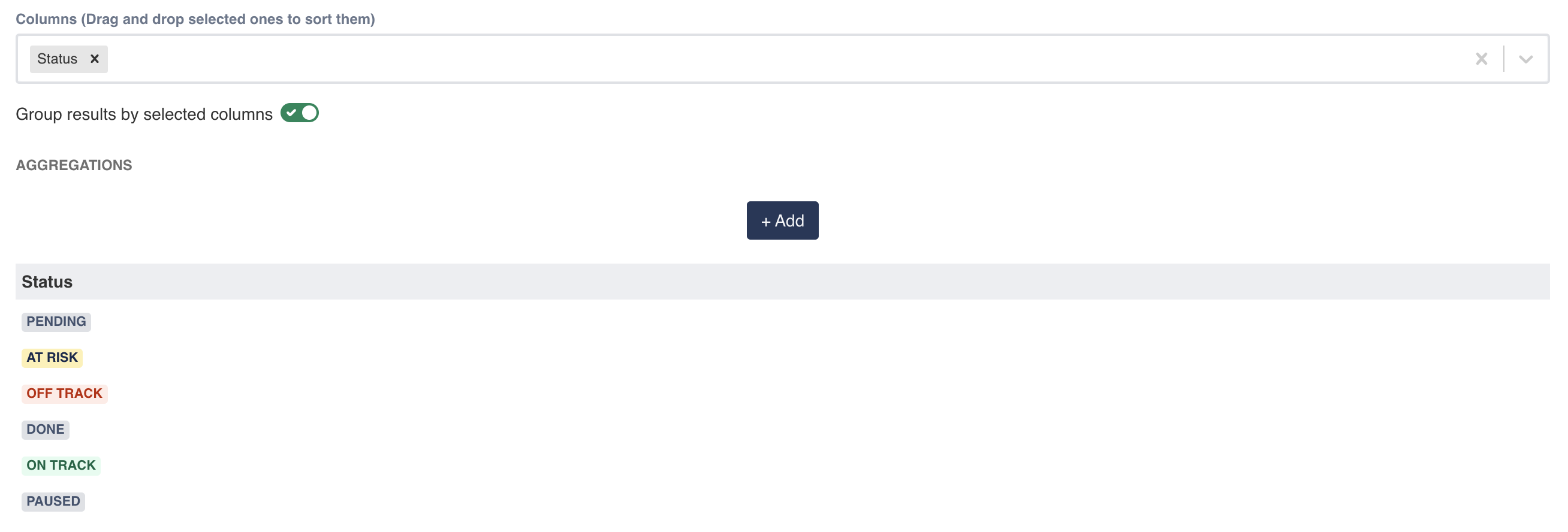
Group results
Group results by selected columns If you are familiar with the GROUP BY statement in SQL, you’ll quickly find interesting uses to group the results of your PQL. If you select to group the results by the previously selected columns, the result rows will be split into groups, based on their values. Thus, only one row will be displayed for each of the groups, so be careful because this implies constraints on the columns.
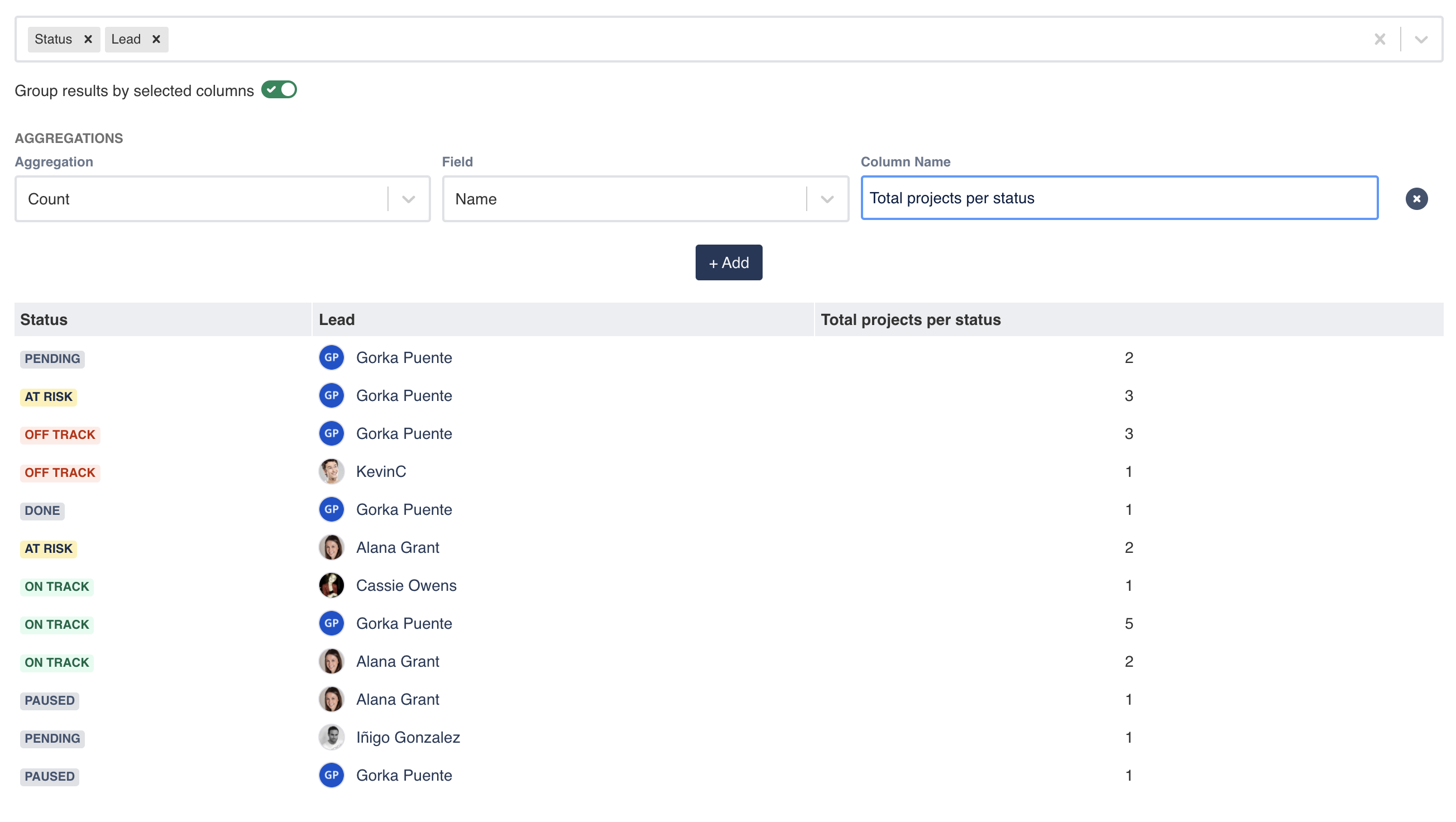
For example, if we filter the previous list of issues by the column Status, the results will show only six rows (one per status) vs one status per project row otherwise.
The grouping of columns is typically combined with aggregations, which moves us to the next section.
Aggregations
Aggregations are also a common in the SQL domain. These functions get the values of grouped rows as the input of that function to return a calculated value. This gadget currently support five functions:
Count. It returns the number of rows in that group.
Sum. It returns the addition of the sequence of the numbers of the group.
Min. It returns the smallest value of the range of values of the group.
Max. It returns the largest value of the range of values of the group.
Mean. The arithmetic mean, it sums the values of the grouped rows and divides the result by how many rows are being averaged.
For example, if we want to indicate the total number of projects per status and lead:
View type: Chart
Remember that:
Chart by. Indicates the x-axis values (horizontal axis), also referred as the series, or in layman terms, the concepts we see in the legend of the chart.
Type. Is the aggregation you want to apply to the field: count, sum, max, min, mean. Check the aggregations section.
Field. Indicates the y-axis values (vertical axis), what do we want to plot in the chart.
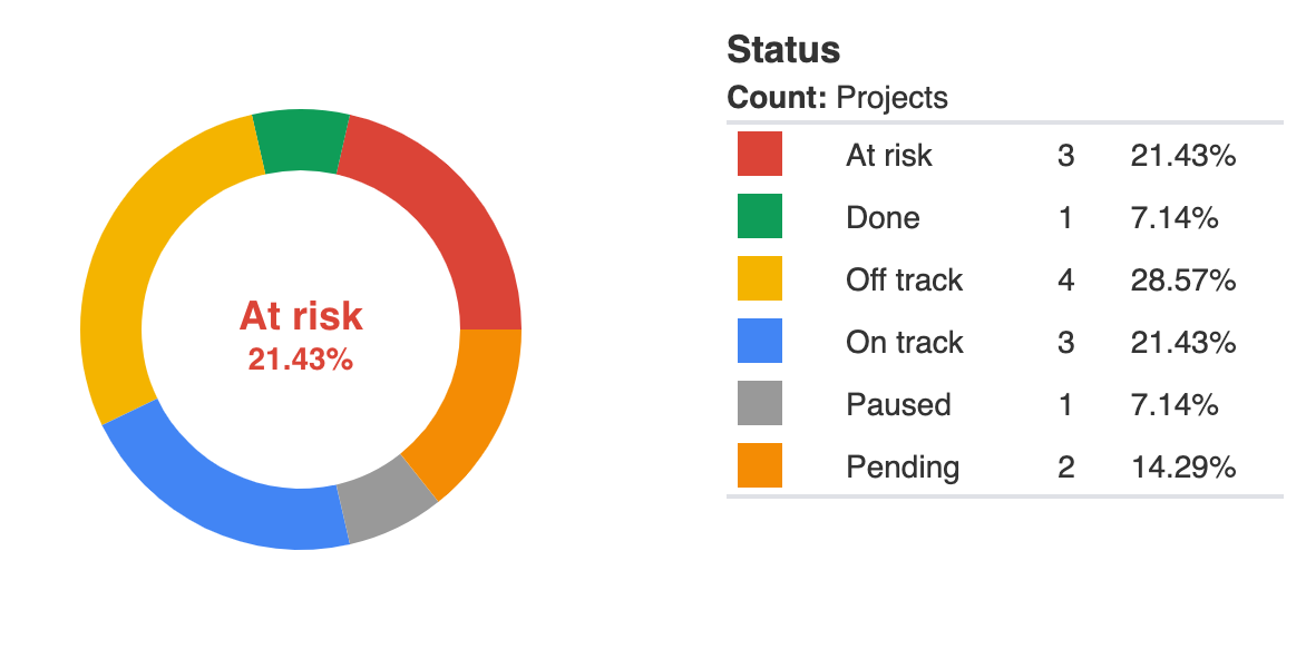
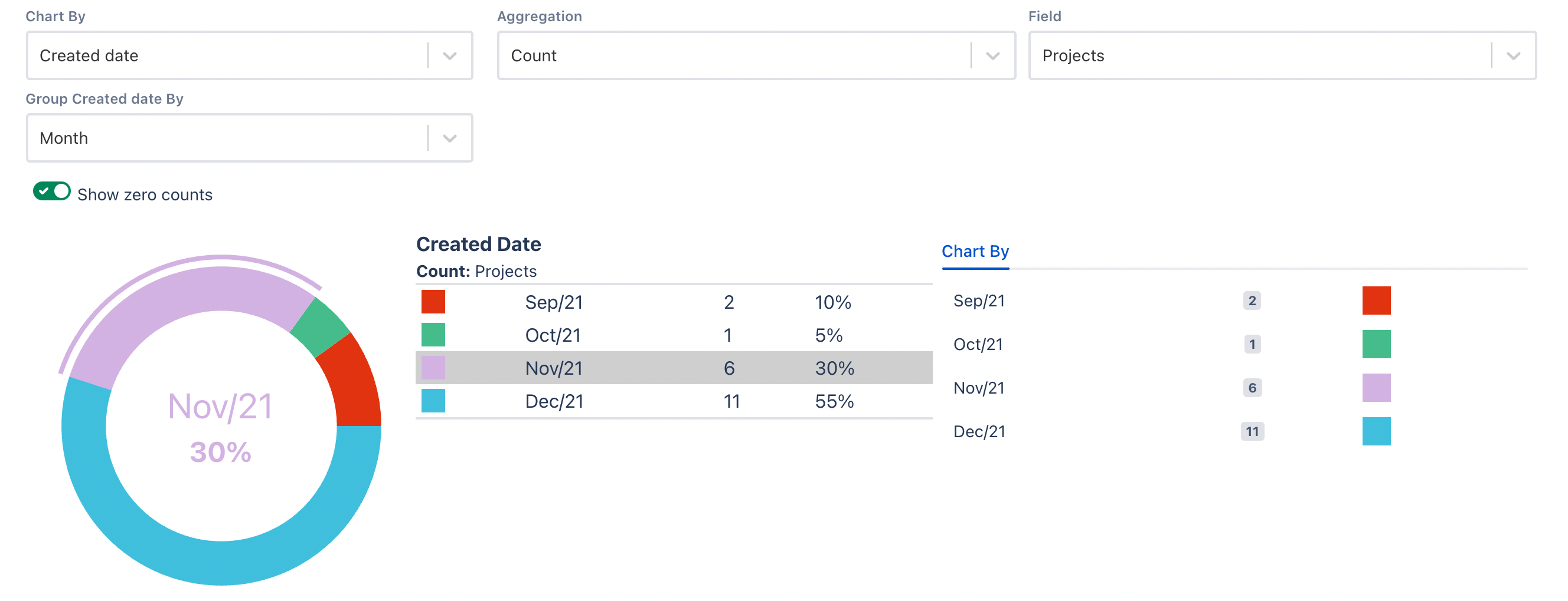
Pie chart
A pie chart is a visualization of your data in a circular graph, where each slice indicates the quantity of the result of your PQL. When a pie chart has several sections or slices, it’s difficult to compare one with another. To overcome this inconvenience, the pie chart comes with a table indicating the values of each slice and the % it represents.
When the field selected in “Chart by” has a date format e.g., Created, a new selector appears to allow grouping by day, week, month, quarter or year, making the results easier to understand and communicate.
Custom colors
Colors have the power of communicating meaning, provoke emotions and highlight information. In projects we give colors to priorities, status and logos, so a quick glance gives us enough information to transmit information, provoke reactions or prompt responses.
All charts display the ability of changing the color of each specific segment or value:
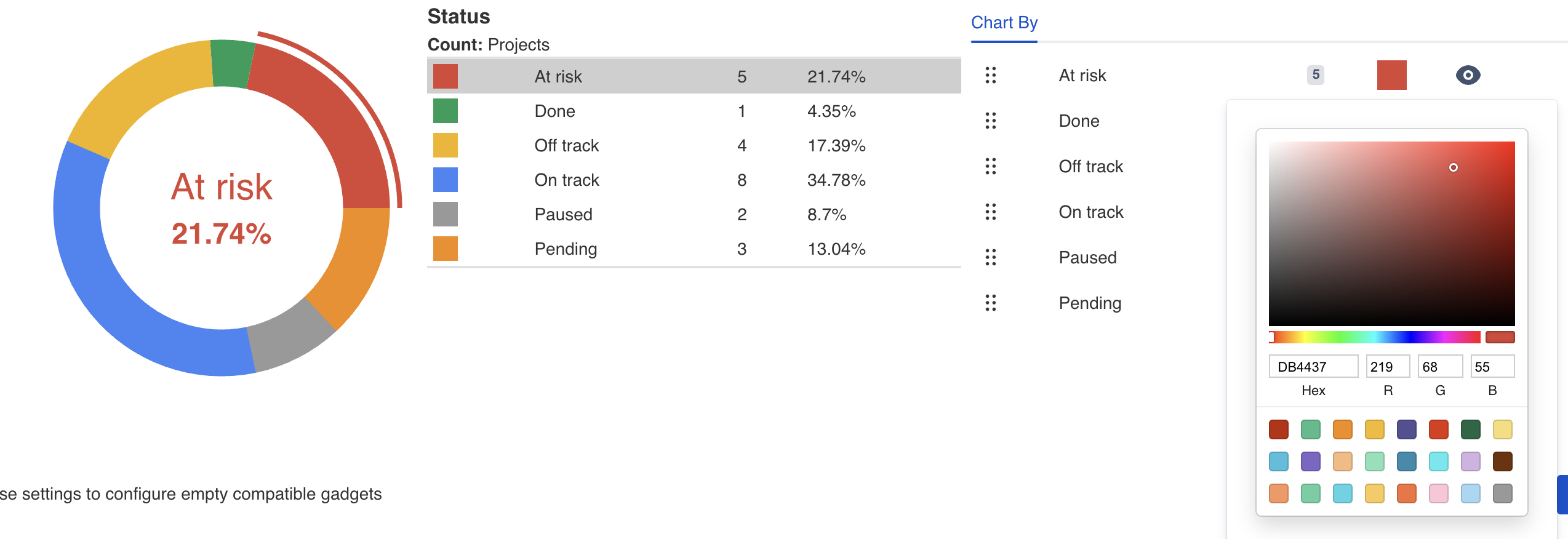
The provided color picker permits the selection of colors by hexadecimal codes, RGB or our pre-defined 24 colors palette (selected based on the right contrasts and tones).
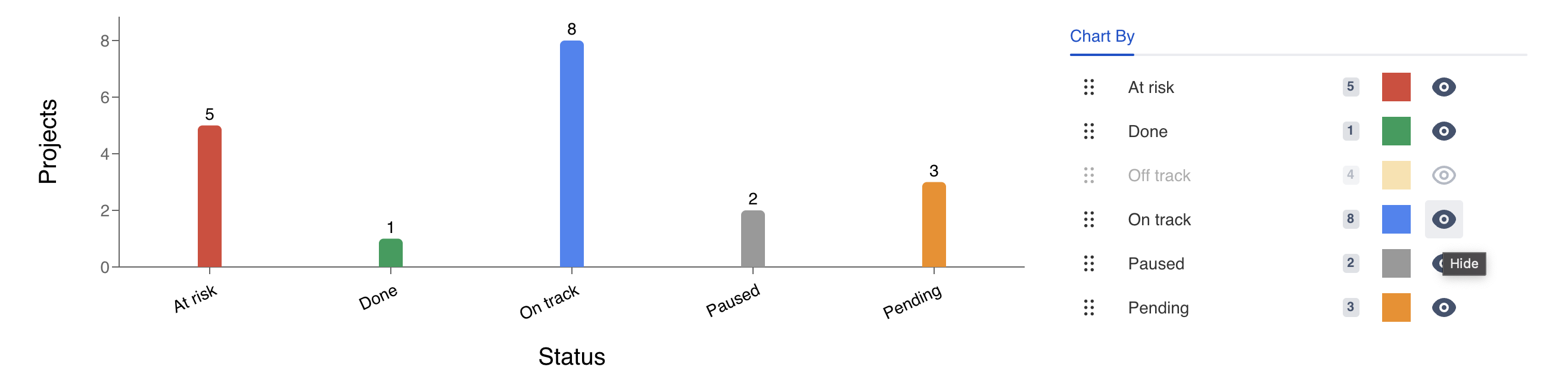
Hide segments
The silence, as well as the absence of elements are key to properly communicate information. It’s up to the ability of the chart creator to master this skill. We just give you the tools. Clicking on the 👁 eye icon, the corresponding segment is hidden (or shown) in the chart:
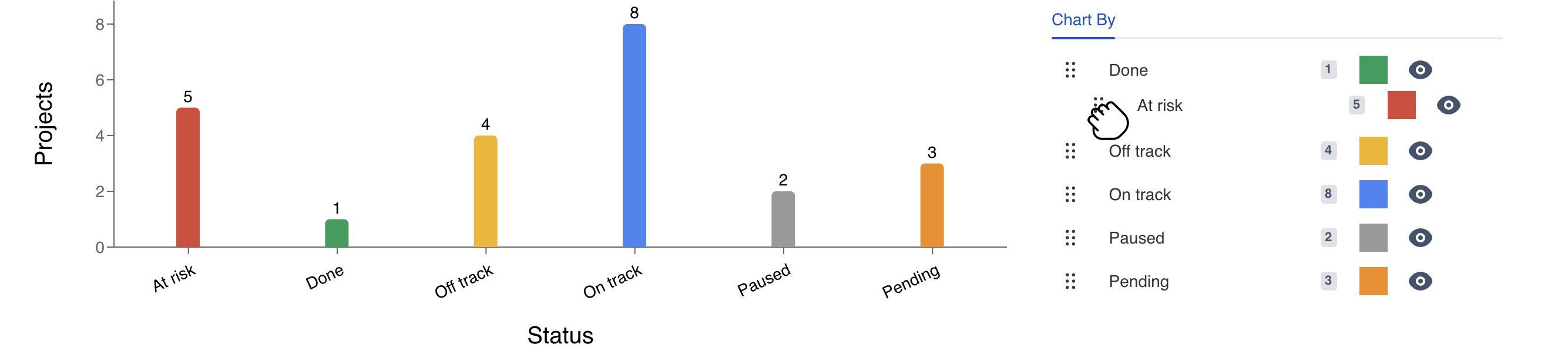
Reorder segments
With a similar aim of customizing the colors or hiding segments, moving around the existing segments to new positions reinforces the message of the information we are transmitting to the target audience.
For doing so, drag and drop the segments or values from the six dots in the left side of the segments, upwards or downwards, to the new position, and the chart will be updated accordingly.
Configuration
Name your gadget meaningfully, so everyone knows at a glance what it is about and when to use it. Fill out the rest of the fields as applicable, namely:
The datasource, select a Projectrack datasource, remember that you have to create this datasource first, to indicate where it is installed.
The PQL (Jira Query Language) query (see the PQL documentation). If the PQL field is empty and you click “Load”, all the projects will be requested to the source instance, in case of very large instances, this could cause performance issues. We recommend adding at least one clause, as an example, to return all the projects with an End date and High or Blocker priority use the clause
"Priority" IN ("High", "Blocker") AND "End date" is not empty. Worth mentioning that the result of a query is not fixed and can change over time.The View Type parameter to indicate the visual representation of the PQL query results: Table, line chart, tile chart, pie chart, bar chart, grouped bar chart, stacked bar chart or multi line chart.
The Chart by parameter (just for charts) to select the x-axis value, in other words, what you see in the horizontal axis. These values or concepts are indicated in the chart legend.
The Type parameter (just for charts) to indicate what type of aggregation you want to apply to the field parameter: Count, sum, max, min, mean. Check the aggregations section.
The Field parameter (just for charts) to select the y-axis values (vertical axis), think of what you want to count (or any other aggregation) and plot in the chart.
The columns (just for the table view) that will appear in the list to display the search results. At least one column has to be present. Drag and drop to reorder the columns.
Group results by selected columns (just for the table view) in case you want to group the results of the query by the previously selected columns. The resulting rows the result rows will be split into groups, based on their values. Check the group results section.
The aggregations (just for the table view) in case you need to perform calculations -Count, sum, max, min, mean- over the results. Check the aggregations section.
Finally, indicate if you want to use the current settings for all the compatible gadgets in the dashboard. This option eases the pain of configuring one by one the rest of the gadgets with the same default configuration
Integrations

We are working on our growing catalog of Dashboard Gadgets: KPIs and Metrics and Dashboard Integrations: Supported Products, but contact us you want us to expedite a specific one, visit our Help Center.
Dashboards
This gadget is not included in any pre-defined dashboard, check other orphan gadgets: