JQL Custom Charts
Overview
Teams have their own key insights for their Jira Software projects, agents need specific answers to be solved for their Jira Service Management queues, and so on and so forth. You could name more examples where a user need to perform a different query to search in Jira for relevant information. That’s why the Jira Query Language (JQL) was built for. It’s a powerful search based on clauses (field + operator + value) to return a list of issues, which for the sake of reuse, can be saved as filters.
This gadget displays the result of a JQL query or an existing filter, as a table or a chart. Select a predefined filter or a custom JQL Select filter or custom JQL, then indicate how you want to display the results View Type, the Columns you want to display in your report in case of a table (drag and drop to change the order), and performing grouping and/or aggregations (see next sections for further information).
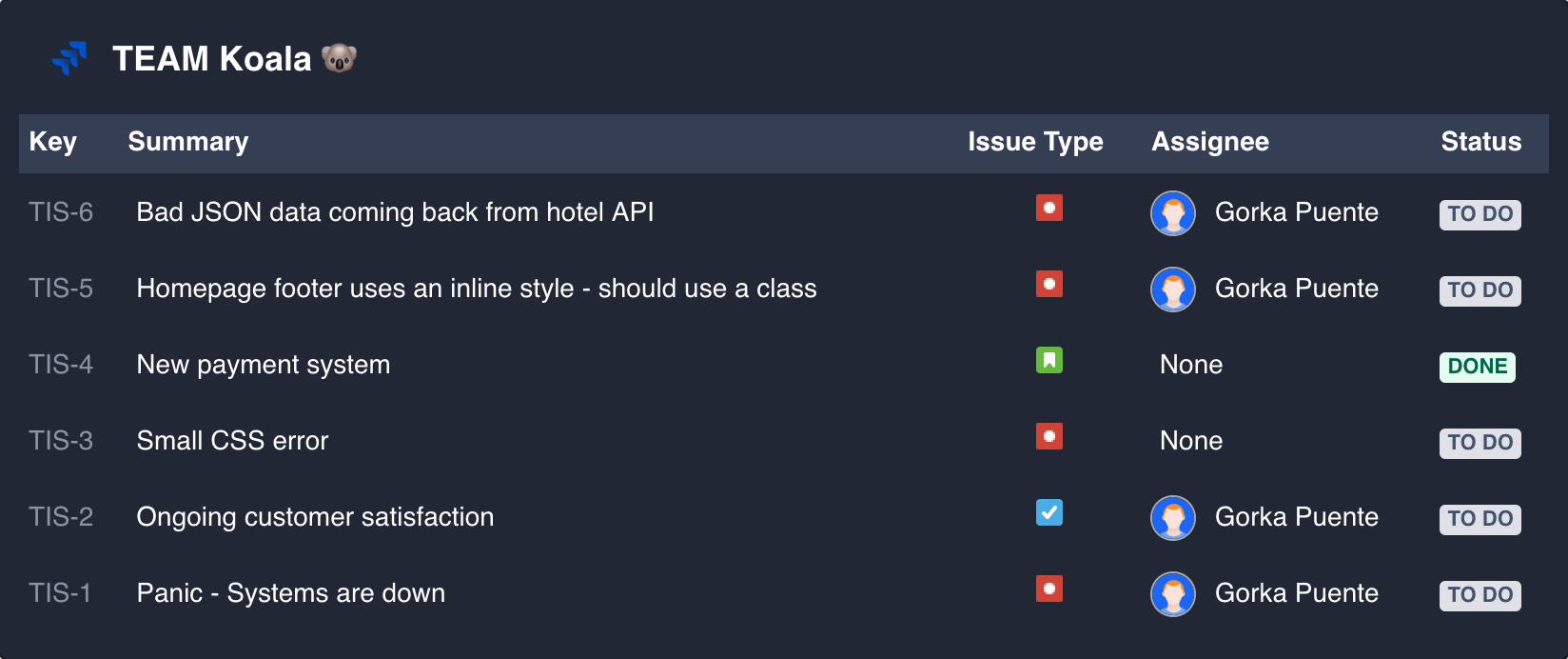
For example, to list all the issues in the “Teams in Space” project (project = “TIS”) and still pending to do (status = "TO DO") sorted by CreationDate in descending order (ORDER BY created DESC) you’ll type the following JQL query
project = "TIS" AND status = "TO DO" ORDER BY created DESC
Get started with JQL or have a look to the Advanced Search to master queries in Jira
You can select any of the following visual metaphors to represent the resulted data by the JQL in the View Type field: Table, line chart, tile chart, pie chart, bar chart, grouped bar chart, stacked bar chart or multi line chart.
View type: Table
The results of your JQL query as a table, where you can select which columns are displayed.
Group results
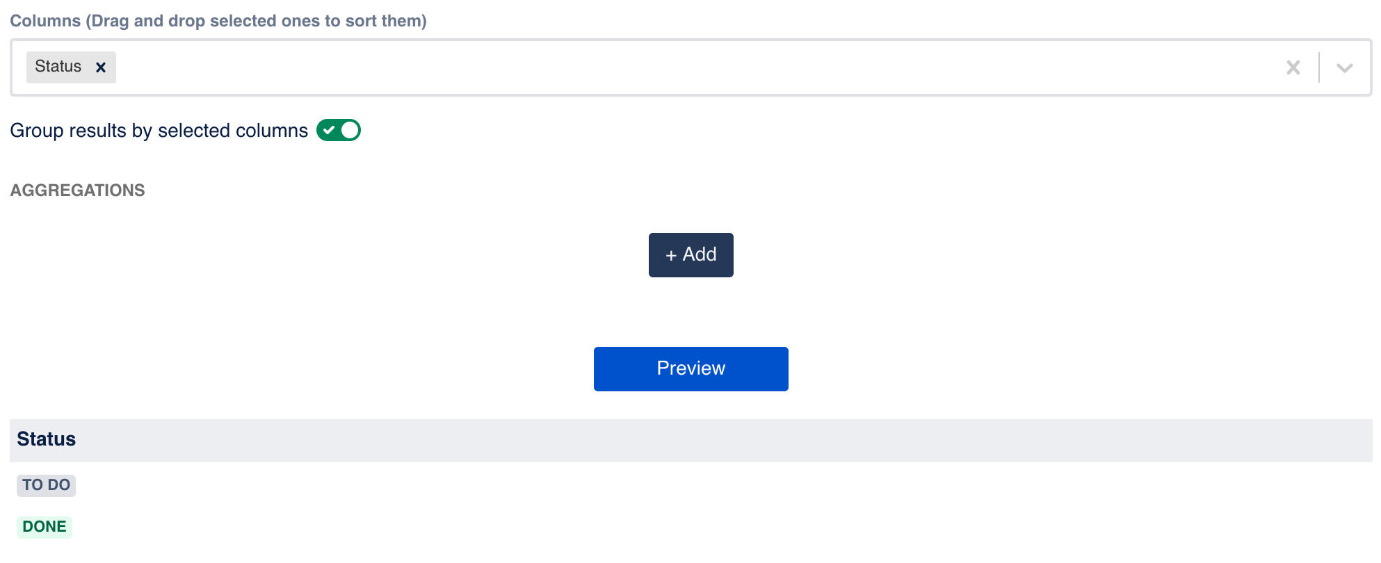
Group results by selected columns If you are familiar with the GROUP BY statement in SQL, you’ll quickly find interesting uses to group the results of your JQL. If you select to group the results by the previously selected columns, the result rows will be split into groups, based on their values. Thus, only one row will be displayed for each of the groups, so be careful because this implies constraints on the columns.
For example, if we filter the previous list of issues by the column Status, the results will show only two rows, one for the status To Do and other for the status Done.
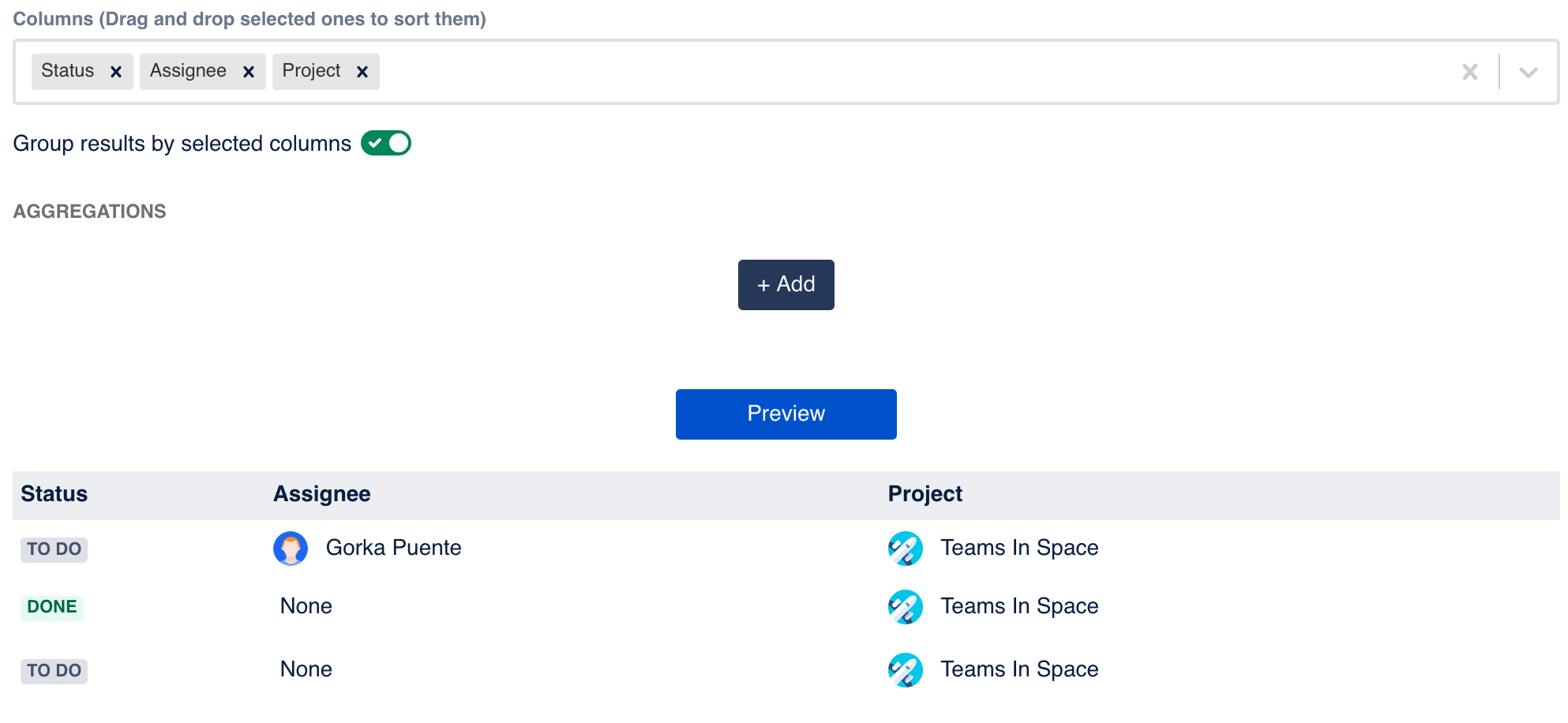
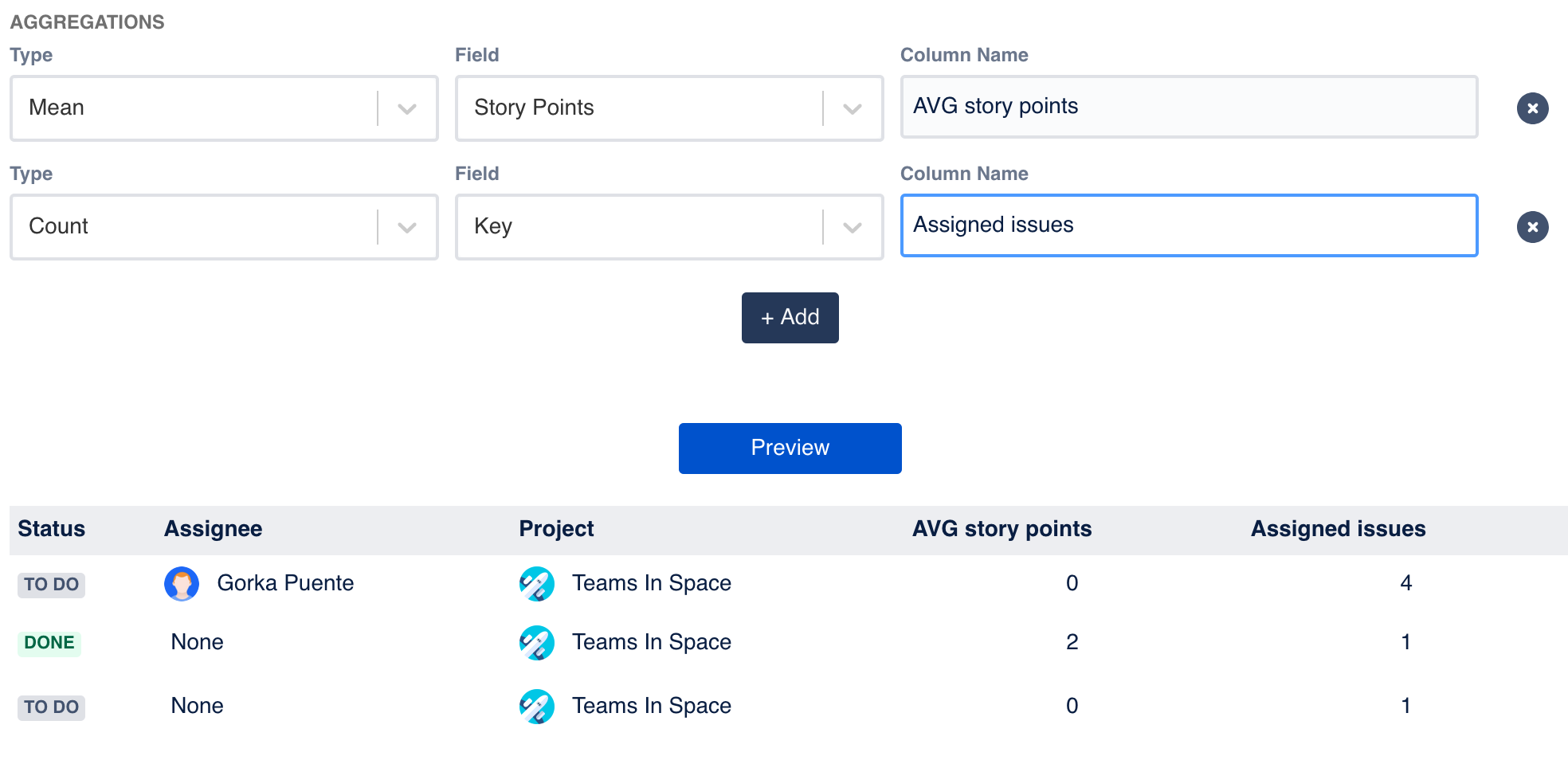
And if we select these three columns: Status, Assignee and Project, the resulting list will display three rows like in the following image:
The grouping of columns is typically combined with aggregations, which moves us to the next section.
Aggregations
Aggregations are also a common in the SQL domain. These functions get the values of grouped rows as the input of that function to return a calculated value. This gadget currently support five functions:
Count. It returns the number of rows in that group.
Sum. It returns the addition of the sequence of the numbers of the group.
Min. It returns the smallest value of the range of values of the group.
Max. It returns the largest value of the range of values of the group.
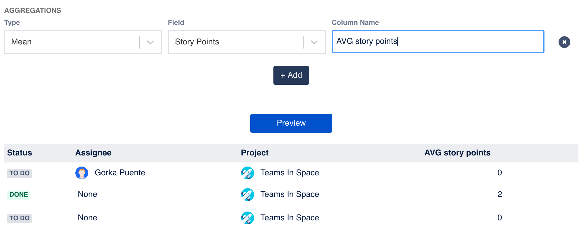
Mean. The arithmetic mean, it sums the values of the grouped rows and divides the result by how many rows are being averaged.
For example, if we want to calculate the mean of the story points
View type: Chart
Remember that:
Chart by. Indicates the x-axis values (horizontal axis), also referred as the series, or in layman terms, the concepts we see in the legend of the chart.
Type. Is the aggregation you want to apply to the field: count, sum, max, min, mean. Check the aggregations section.
Field. Indicates the y-axis values (vertical axis), what do we want to plot in the chart.
Line chart
A line chart represents the results of your JQL query as a series of data points connected by a straight line. It’s common to visualize trends over periods of time or dates in the x-axis.
Multi line chart
This chart is a line chart with more than one line, which is useful when we need to compare data in a time series or trends.
Tile chart
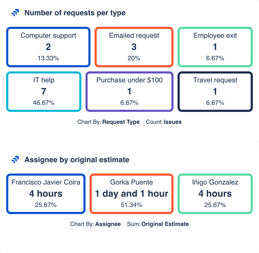
This visual representation presents the information in a set of tiles. You can display the result of your JQL and apply aggregations. For example, you can display the number of request of each request type of your Jira Service Management support desk, or display the sum of all the original estimates of the assigned issues, by assignee.
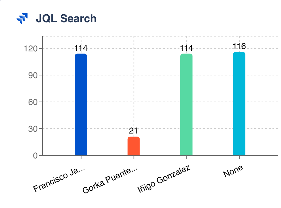
Bar chart
A bar chart represents the results of your JQL query as a series of rectangular bars with the height proportional to the represented values. It’s useful to compare results of different types or categories.
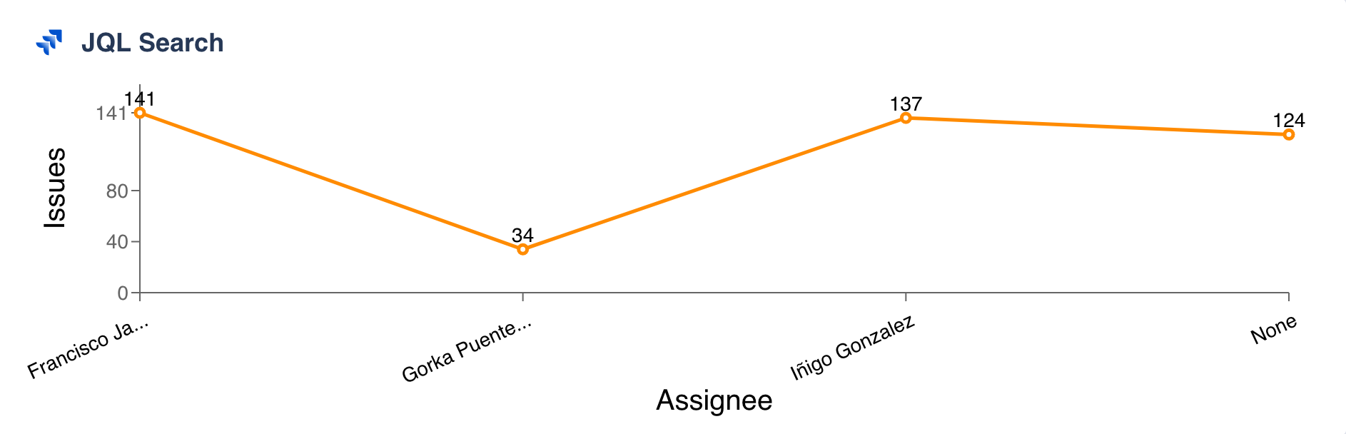
For example, Chart by assignee, type count and field issues would display a chart where each assignee would display the number of assigned issues:
Grouped bar chart
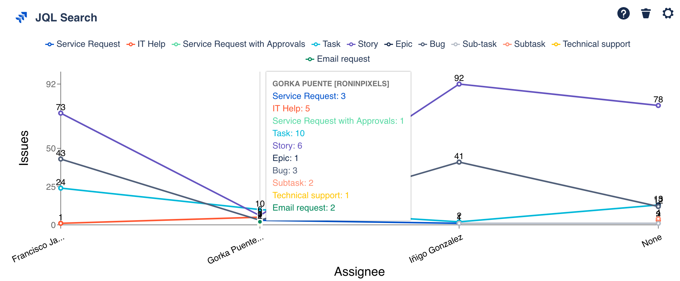
We can perform more complex comparisons of the information returned by our JQL query by grouping by specific fields. In the previous example, we could add a Group by status, and we’d see the number of issues by assignee grouped by the issue status:
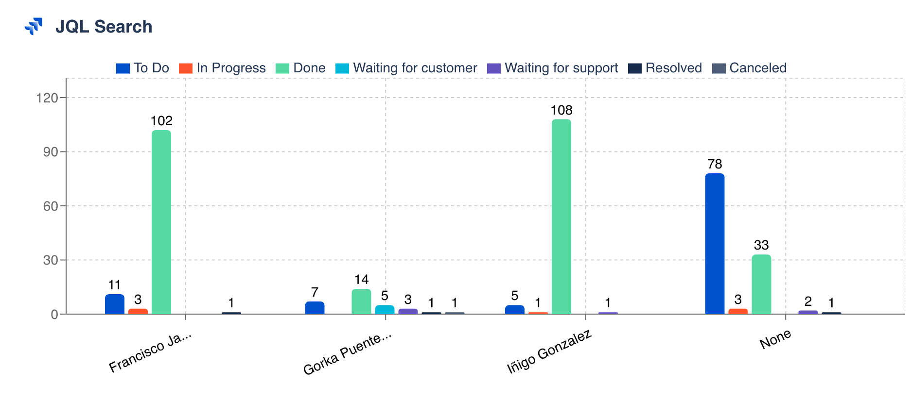
So for each category, in our case the Chart by assignee, there are two or more coloured bars, which labels can be seen at the top of the chart.
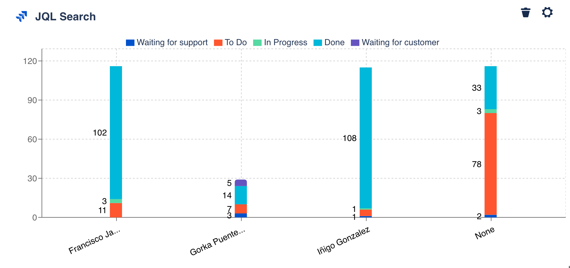
Stacked bar chart
Similar to the grouped bar chart, but in this case, the combined results of the groups is on top of each other. Thus, the height is the combined result, making it not appropriate for cases with negative values.
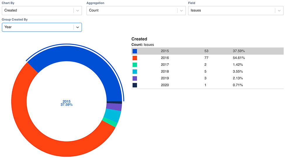
Pie chart
A pie chart is a visualization of your data in a circular graph, where each slice indicates the quantity of the result of your JQL. When a pie chart has several sections or slices, it’s difficult to compare one with another. To overcome this inconvenience, the pie chart comes with a table indicating the values of each slice and the % it represents.
When the field selected in “Chart by” has a date format e.g., Created, a new selector appears to allow grouping by day, week, month, quarter or year, making the results easier to understand and communicate.
Custom colors
Colors have the power of communicating meaning, provoke emotions and highlight information. Within our organizations and teams, it’s common to associate concepts to specific colors, making easier and quicker the communication of ideas and information.
Whenever you select a chart, you’ll be able to select the color of each specific segment or value of it:
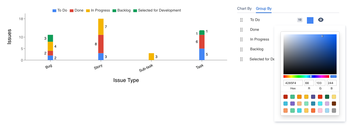
The color picker allows the selection of a color either by hexadecimal code, RGB or our pre-defined 24 colors palette (selected based on the right contrasts and tones).
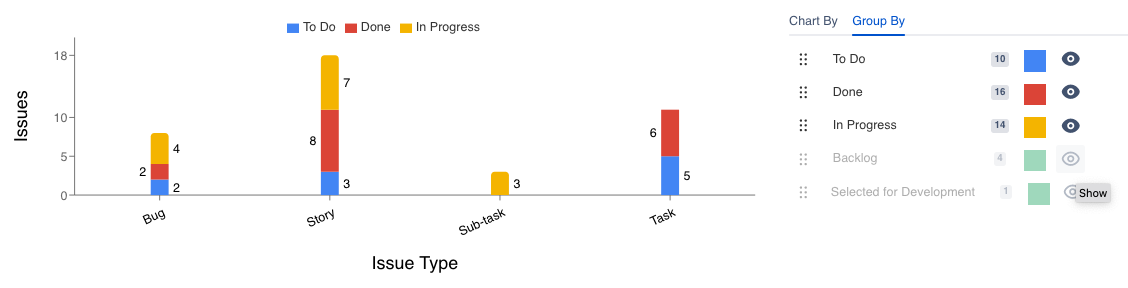
Hide segments
Not all the results are needed when communicating information in a chart, sometimes because one of those values or segments distorts the results or deviates the attention.
Clicking on the 👁 eye icon, the corresponding segment is hidden (or shown) in the chart:
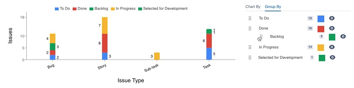
Reorder segments
In the same line of hiding segments or customizing the colors of our charts, rearranging the position of the existing segments or values reinforces the way we transmit the information with our charts.
Just drag and drop any segment or value from the six dots in the left side of the segments and move it upwards or downwards to the correct place, and the chart will be updated accordingly.
Configuration
Name your gadget meaningfully, so everyone knows at a glance what it is about and when to use it. Fill out the rest of the fields as applicable, namely:
The datasource, where the source Jira instance is installed.
The JQL (Jira Query Language) query or filter to filter the list of issues (see the JQL documentation). If you don’t add any and click “Load”, the gadget will request all the content in the source instance, this might cause performance issues. We recommend to add at least one clause, for example to list all the issues of the project Teams in Space use the clause
project = "TIS”. And remember that the gadget returns the results of the query, which are not fixed and could change over time.The View Type parameter to indicate the visual representation of the JQL query results: Table, line chart, tile chart, pie chart, bar chart, grouped bar chart, stacked bar chart or multi line chart.
The Chart by parameter (just for charts) to select the x-axis value, in other words, what you see in the horizontal axis. These values or concepts are indicated in the chart legend.
The Type parameter (just for charts) to indicate what type of aggregation you want to apply to the field parameter: Count, sum, max, min, mean. Check the aggregations section.
The Field parameter (just for charts) to select the y-axis values (vertical axis), think of what you want to count (or any other aggregation) and plot in the chart.
The columns (just for the table view) that will appear in the list to display the search results. At least one column has to be present. Drag and drop to reorder the columns.
Group results by selected columns (just for the table view) in case you want to group the results of the query by the previously selected columns. The resulting rows the result rows will be split into groups, based on their values. Check the group results section.
The aggregations (just for the table view) in case you need to perform calculations -Count, sum, max, min, mean- over the results. Check the aggregations section.
Finally, indicate if you want to use the current settings for all the compatible gadgets in the dashboard. This option eases the pain of configuring one by one the rest of the gadgets with the same default configuration
Integrations
:jira_software:
:jira_service_management:
We are working on our growing catalog of Dashboard Gadgets: KPIs and Metrics and Dashboard Integrations: Supported Products, but contact us you want us to expedite a specific one, visit our Help Center.
Dashboards
This gadget is not included in any pre-defined dashboard, check other orphan gadgets: